Cartier’s Secret Strength: Making a Watch Feel Like a Sentence
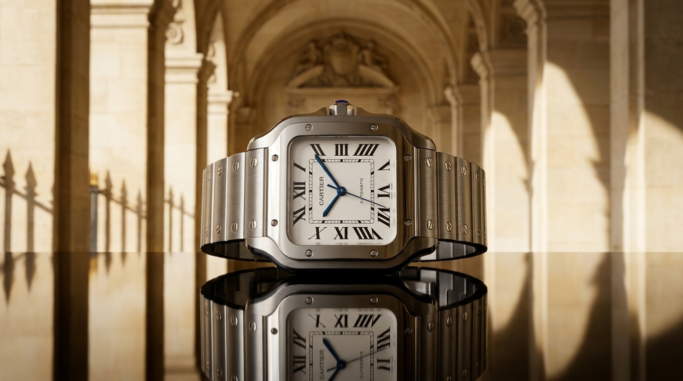
On the dial of a Tank Louis Cartier, the minute railway does not merely mark time; it holds the whole face in place, like a ruled margin around a page. The Roman numerals press toward it with just enough insistence. The hands, blue and narrow, seem less like hands than marks of punctuation. At six, where the eye expects only symmetry, the word “Swiss Made” sits small and obedient. Somewhere inside one of the numerals, often in the VII or X, Cartier hides its own name in miniature, a signature folded into the architecture rather than signed across it.
Cartier’s great trick has never been spectacle in the usual horological sense. Other houses expose the machine, polish the bridge until it becomes theatre, or build whole reputations on the visible labour of wheels and levers. Cartier, when it is at its strongest, does something quieter and more difficult. It makes a watch feel inevitable. The case, dial, numerals, crown, hands and strap do not gather like separate parts. They arrive as syntax. Remove one element and the sentence falters.
This is why Cartier watches are so often described badly. Language reaches too quickly for elegance, for old-world ease, for the vocabulary of salons and black lacquer furniture. Those words are not entirely wrong, but they soften the thing they mean to praise. The best Cartier watches are not soft. They are strict. The Tank is strict. The Santos is strict. The Cintrée, for all its curve, is strict. Even the Crash, which appears to have survived a private catastrophe, is governed by discipline. Its distortion is not looseness but grammar under pressure.
The Tank, born in 1917 and entering production a few years later, is the clearest case. Its origin story, tied to the aerial view of a Renault tank from the First World War, has been repeated so often that it risks becoming decorative. Yet the important point is not the anecdote but the translation. Cartier did not make a military watch. It made a shape from a machine of war and drained it of noise. The brancards became parallel rails running down the case. The dial became a rectangle held between them. The strap left the case so naturally that the lugs almost disappear. Nothing swells unnecessarily. Nothing begs to be noticed.
A Tank Louis Cartier in yellow gold can seem almost plain until its proportions begin to work on the eye. The case is neither a square nor simply a rectangle, but a controlled field. The bezel has width without heaviness. The cabochon sapphire on the crown is not large, yet it changes the temperature of the whole object, a drop of blue at the edge of the gold. The Roman numerals are elongated to the border, not printed as labels but stretched as part of the drawing. This is not dial design in the modern modular sense. It is composition.
Inside, Cartier’s relationship with movements has always been more complicated than the surface suggests. Early wristwatches relied on the highest specialists of the age, including Edmond Jaeger and LeCoultre through the European Watch and Clock Company. Later Tanks would carry hand-wound calibres from Jaeger-LeCoultre, Frédéric Piguet, Piaget, and Cartier’s own manufacture efforts. In recent Tank Louis models, the small hand-wound 1917 MC gives the watch a mechanical pulse appropriate to its restraint. It is not a movement designed to dominate conversation through depth, chronometry claims or exhibition drama. Its relevance is one of scale and behaviour. A thin rectangular gold watch should not feel overbuilt. It should close around the wrist with the discretion of a well-made clasp.
That idea of fit—physical, graphic, cultural—is central to Cartier’s secret strength. Many watches are designed as objects first and worn second. Cartier’s enduring forms seem to begin at the wrist and work outward. The watch is not a disc strapped to the body but a line that continues across it. This is why the brand’s rectangles and curved cases have survived changes in fashion that buried larger, louder inventions. The Tank does not need to look contemporary because it never relied on the contemporary. It relied on proportion, and proportion ages differently.
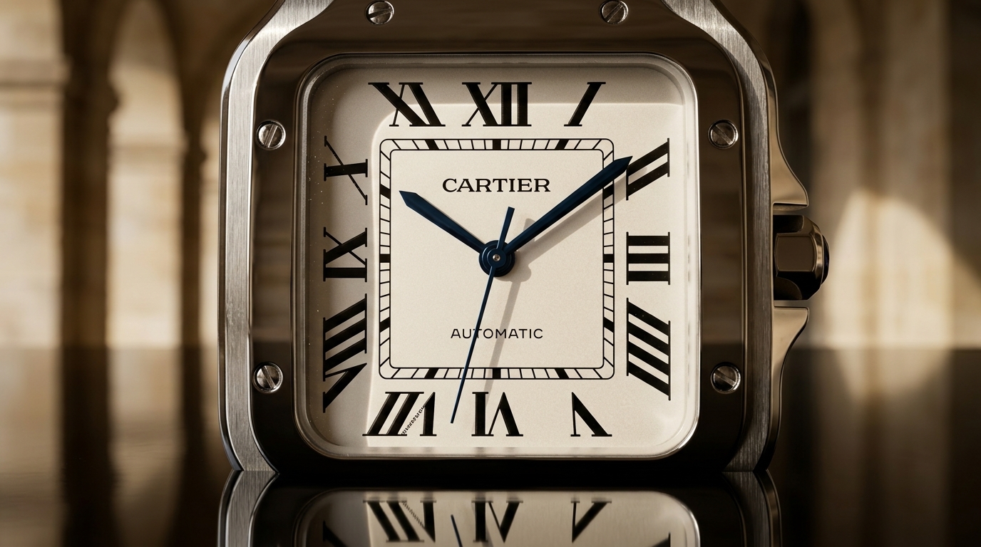
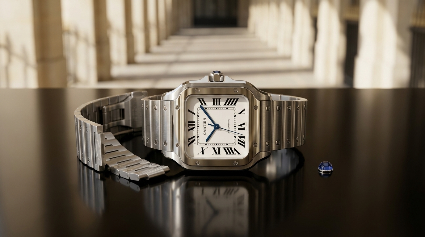
The Santos, too, is often trapped inside its own legend. In 1904, Louis Cartier made a wristwatch for Alberto Santos-Dumont, the Brazilian aviator who needed to read the time while flying. This fact gives the Santos one of the cleanest origin stories in wristwatch history: a practical object for a modern man in a new machine age. But again, the myth obscures the design. The Santos is not important merely because it is early. It is important because its square case and exposed screws turned construction into ornament without making ornament feel applied.
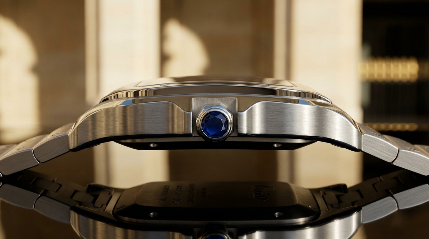
The screws on the bezel remain crucial. They are not arranged with the decorative delicacy of jewellery. They have the look of fasteners, of a machine made legible. Yet on a Santos, they form rhythm. The bezel’s rounded square softens the geometry just enough that the watch avoids severity. The bracelet, especially in later versions, carries the screw motif across the wrist, but the best Santos designs understand restraint. The watch must retain air. It cannot become a cuff.
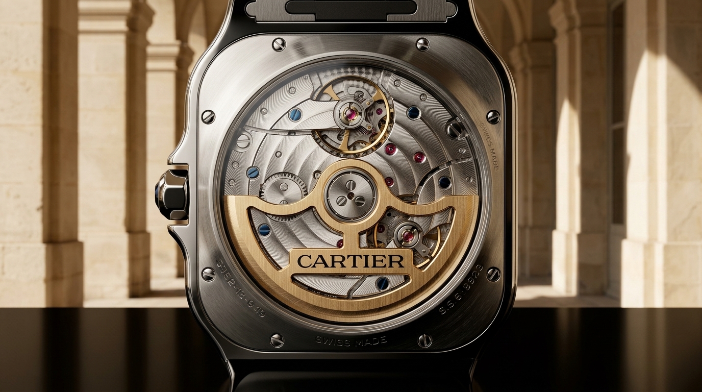
Modern Santos models often house the Cartier 1847 MC automatic calibre, a relatively straightforward in-house movement with the practical character that suits the line. There is sense in that. The Santos has always carried the memory of utility, however polished its present surface may be. In the slimmer Santos-Dumont models, especially the mechanical versions, the case becomes more architectural and less sporty. The bezel seems drawn with a ruler and then warmed by hand. With a hand-wound calibre inside, the watch returns to something closer to its original tension: aviation reduced to a civilised square.
Cartier’s shapes are easy to recognise because they are not simply cases. They are complete arguments. A round watch can change its lugs, crown, dial furniture and bracelet and still remain, at root, another round watch. Cartier’s great forms are less forgiving. A Tank with the wrong numeral weight becomes weak. A Santos with screws treated as costume becomes coarse. A Cintrée with the wrong curve loses its entire reason for being. The brand’s masterpieces live within narrow margins, and those margins are the point.
The Tank Cintrée may be the purest expression of this risk. Introduced in 1921, it takes the Tank idea and bends it lengthwise until the case arcs with the wrist. The name itself means curved, but the word hardly prepares the eye for the thing. A Cintrée is long, sometimes startlingly so, and narrow enough to make round watches look blunt beside it. The dial is stretched vertically; the numerals climb and descend like architecture seen in perspective. The case does not sit on the wrist so much as follow it.
Here the sentence becomes elongated, almost musical. The brancards are not merely side rails but lines under tension. In historic examples, the small movements had to accommodate the extreme form. In modern Privé editions, calibres such as the 9780 MC, based on the thin Piaget 430P architecture, have allowed Cartier to preserve thinness without turning the watch into a hollow costume of its ancestor. The movement matters because the case demands it. Thickness would ruin the phrase. A Cintrée that stands too high is no longer a Cintrée in spirit; it becomes a quotation with bad pronunciation.
This is where Cartier differs from brands that treat heritage as a catalogue of visual codes. A Cartier watch cannot be revived successfully by copying the outline alone. The mass must be right. The dial must breathe correctly inside the case. The strap must pull from the body at the proper angle. The crown must appear almost too delicate, until it is understood as the necessary final mark. In the very best versions, the watch seems drawn in one movement, though in reality it is the product of accumulated correction.
The Crash proves the same point by seeming to disprove it. Its origin, usually placed in London in the 1960s, has attracted stories: a watch mangled in an accident, a shape born from Swinging London, Cartier formal language bent into surrealism. Whatever the precise beginning, the object itself is what remains. The Crash looks melted, but it is not shapeless. Its case ripples with careful force. The dial numerals stretch and tilt, yet remain readable enough to remind the viewer that distortion has a standard to depart from. Without the Tank’s discipline behind it, the Crash would be whimsy. With that discipline, it becomes one of the strangest successful wristwatches ever made.
Its mechanical life has also depended on discretion. Modern Crash watches have used small hand-wound movements such as the 8970 MC, allowing the case to retain its asymmetric thinness. The calibre is not the spectacle. The spectacle is the survival of order inside the bent frame. That is Cartier’s most unusual horological intelligence: it understands when the movement should speak and when it should remain behind the wall, keeping time while the grammar of the case does the more visible work.
This does not mean Cartier lacks technical ambition. The maison has produced high complications, mysterious movements, skeletonised calibres shaped into Roman numerals, and fine watchmaking from its manufacture in La Chaux-de-Fonds. The Masse Mystérieuse, the Astrocalendaire, the various Rotonde complications and the skeleton Santos models all show a company capable of entering the mechanical arena on explicit terms. Yet the deepest Cartier identity is not found in complication for its own sake. It is found when mechanism is absorbed into form, when the watch does not advertise effort but makes effort disappear.
The “mystery” clocks, with hands apparently floating free in rock crystal, reveal an old Cartier instinct: conceal the means, intensify the image. In watches, that instinct becomes more intimate. The wearer does not need to see the train of wheels to feel that something exact is happening. The exactness is visible in the alignment of ink, the polish of a bevel, the meeting point of strap and case. Cartier’s finishing, at its most persuasive, is not about dazzling under a loupe. It is about surface behaving correctly in light. A polished gold brancard catching a narrow line at its edge can say as much as a decorated bridge hidden under a sapphire back.
The dial language deserves its own scrutiny because it is often mistaken for mere tradition. Roman numerals are everywhere in watchmaking, but Cartier’s are particular. They are tall, compressed, sometimes slightly warped to obey the case. The chemin de fer minute track establishes a boundary between timekeeping and ornament. The hands are usually sword-shaped or Breguet-influenced depending on the model, but they rarely become large enough to disturb the dial’s equilibrium. The hidden signature inside a numeral is more than a charming anti-counterfeit device. It is a clue to the brand’s method: Cartier signs from within the design, not over it.
There is also the matter of scale, which modern watch culture often treats as a contest of presence. Cartier has generally been better when it resists that contest. The older Tank Louis sizes, the smaller Baignoire, the long and narrow Cintrée, the compact Santos-Dumont—these watches understand that the wrist is not a billboard. Their authority comes from precision of placement. A small Cartier can have more force than a large watch because it leaves room around itself. Space becomes part of the design.
This is not nostalgia for miniature watches. Cartier has made larger pieces that work, and changing wrists, tastes and expectations cannot be dismissed. But the maison’s language has limits in a way that many sports watch languages do not. Enlarge a Tank too bluntly and the numerals become furniture. Thicken a Baignoire and the oval loses its liquid tension. Expand a Crash excessively and the distortion turns theatrical. Cartier’s greatest watches ask for control because their beauty is structural, not decorative.
The Baignoire, with its elongated oval case, shows the same syntactic intelligence in a softer register. Its name, meaning bathtub, might suggest levity, but the watch itself is a lesson in continuous line. The oval is not a perfect ellipse; it is pinched and extended, a shape that appears simple only because its decisions are hidden. The dial follows the case, the numerals lean into the curve, and the crown interrupts the perimeter with a necessary flick. It is one of Cartier’s most difficult forms to imitate because any error in thickness or outline immediately becomes visible.
The Pebble, or Baseball as it has sometimes been called, belongs to a similar family of controlled oddities. A circular dial set inside a rounded square case, originally emerging from Cartier London in the 1970s, it carries the wit of geometry without collapsing into joke. Recent revivals have shown how delicate such balance is. Too much polishing, too much size, too much reverence, and the object can stiffen. But when the proportions hold, it feels like a private note passed between designers—roundness disciplined by corners, corners softened by light.
Cartier’s London, Paris and New York branches each contributed to this history with subtle differences of imagination. London in the 1960s and 1970s gave Cartier some of its most daring wristwatch shapes, from the Crash to the Pebble. Paris carried the central language of the Tank and the maison’s jewelled authority. New York added its own commercial and stylistic inflections. The old tri-city Cartier world was not a single design office issuing global uniformity. It was a conversation conducted in gold, enamel, ink and stone.
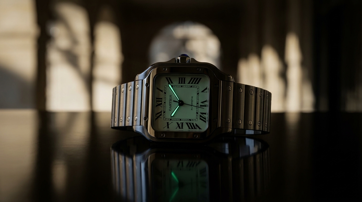
That conversation matters because Cartier watches often feel less engineered than written. Not written casually, but revised. A good sentence depends on weight, pause, tension, release. So does a Cartier case. The first glance catches the shape. The second finds the dial. The third notices how the crown changes the profile, how the strap narrows, how the border controls the numerals, how the numerals control the empty space. There is no need for the watch to announce complexity because the complexity has been compressed into fluency.
This fluency can make Cartier vulnerable to misreading. A watch that looks easy invites the assumption that it was easy to design. A rectangular case, black Roman numerals, blue hands, cabochon crown: the formula sounds almost elementary when reduced to parts. Yet many watches have borrowed those parts and produced only costume. Cartier’s strength lies in the intervals between them. The width of a rail. The length of a hand. The distance between printed minute track and case edge. The way a crystal rises or does not rise. The precise amount of curve required before a straight line becomes alive.
In an age when watch enthusiasm often circles around scarcity, auction records, calibre architecture and steel-sports genealogy, Cartier can seem to belong to another room. But that room has clocks on the mantel, cigarette cases on the table, and drawings pinned somewhere out of sight. Its watches come from a broader decorative intelligence than horology alone. This is sometimes held against them, as if jewellery and design were lesser forms of seriousness than escapements and bridges. The evidence says otherwise. To make a beautiful movement is difficult. To make a watch whose entire exterior reads as one complete thought is difficult in another way.
The secret strength of Cartier is that its best watches do not feel assembled. They feel phrased. The Tank is a declarative sentence, spare and balanced. The Santos is a sentence with visible rivets, practical but urbane. The Cintrée is long, curved, almost breath-held. The Crash is syntax disrupted without losing meaning. The Baignoire is an oval clause drawn tight. None requires shouting. None needs the machinery to step forward and explain the effect.
At the end, the watch returns to the wrist as all watches must. There, Cartier’s grammar faces its final test. A design can be admired in photographs and still fail against skin, cuff, movement, scale. The enduring Cartier forms usually pass because they were never only images. They were built around transition: case to strap, dial to bezel, line to wrist, ornament to use. Their strength is not secrecy in the sense of hidden knowledge. It is secrecy in the sense of compression. The work is present, but folded away.
A Cartier watch, at its best, tells time by making time readable inside a shape that seems already resolved. It does not ask the eye to travel through complication before arriving at meaning. It gives the meaning first, then lets the details deepen it. That is why the finest examples feel less like objects than sentences one understands before parsing. Balanced, exact, and alive with pressure, they show how much can be said when every mark knows where it belongs.