
De Bethune: The Independent Watch Brand Turning Astronomical Science Into Modern Haute Horlogerie
Most luxury watch brands sell you a past. De Bethune sells you a horizon—where blued-titanium skies, mirror-polished cases, and moonphases calibrated like instruments aren’t retro flourishes but the visual evidence of a brand obsessed with physics, light, and the architecture of precision. The result is an independent maison whose watches read less like tributes and more like prototypes that escaped the lab—fully realized, fiercely elegant, and instantly recognizable on the wrist or across a room at midnight under a dial that seems to glow from within.
De Bethune’s proposition: not heritage, but a coherent future
De Bethune is often filed under “independent haute horlogerie,” but that category can blur more than it clarifies. Many independents build their legitimacy by amplifying the romance of old Geneva or Vallée de Joux codes—classical dials, revival typography, and complications presented as museum pieces. De Bethune, by contrast, behaves like a design-and-engineering studio that happens to speak in the language of mechanical watchmaking. Its references are less archival and more astronomical: spherical moons, starfields, radiating guilloché that reads like diffraction, and cases finished like precision instruments.
The brand’s most compelling strength is not any single complication. It is the way materials, finishing, architecture, and display are made to argue one idea: time as something cosmic and contemporary. De Bethune’s watches do not “evoke” the heavens so much as they visualize a model of them—controlled light, controlled surfaces, controlled motion. In a market where the safest play is familiar nostalgia, De Bethune insists that recognizability can be built from a consistent future-facing grammar.
A design language built from physics: blued titanium, mirror polish, and controlled light
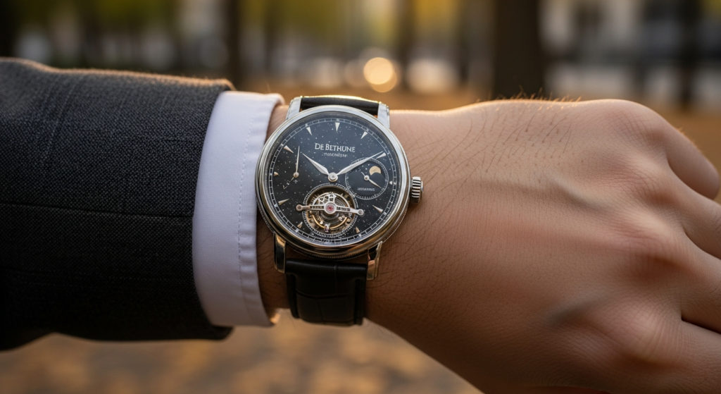
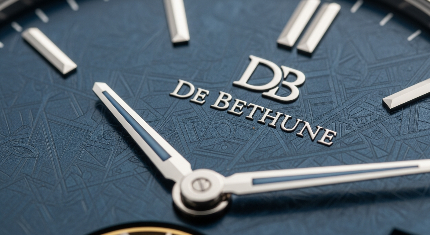
De Bethune’s signature look begins with its relationship to light. The brand’s heat-blued titanium is not the soft navy gesture often seen on hands or screws; it is an expansive, saturating blue deployed as a dial architecture. When executed well, it feels less like color and more like depth—an engineered “night” that absorbs ambient tones and then returns them as a clean, electric sheen. This matters because De Bethune doesn’t use finishing as ornament. It uses finishing as a functional aesthetic: to shape legibility, perceived depth, and the way a watch reads at distance.
Then there’s the casework. De Bethune’s mirror-polished surfaces are not merely glossy; they are unusually exact, with curvature that reads like liquid metal. That polish carries risk—every boundary and line is exposed—but it is also part of the thesis. Reflections become part of the object’s presence, like a polished telescope tube catching stray light. The brand frequently pairs this with engineered lugs that are expressive rather than inherited: floating forms, articulated structures, and profiles that look designed for ergonomics and visual tension, not for historical correctness.
This is where De Bethune separates itself from the “futuristic” label that gets thrown around too casually. Futurism in watchmaking is often confined to case shapes and aggressive materials while the dial remains conventional. De Bethune commits at all levels: the dial’s micro-topography, the three-dimensionality of its indications, the way the moon becomes a sculptural element rather than a printed disc. The result is a watch that reads as one object, not a collection of cues.
The technical backbone: proprietary solutions that serve a single aesthetic argument
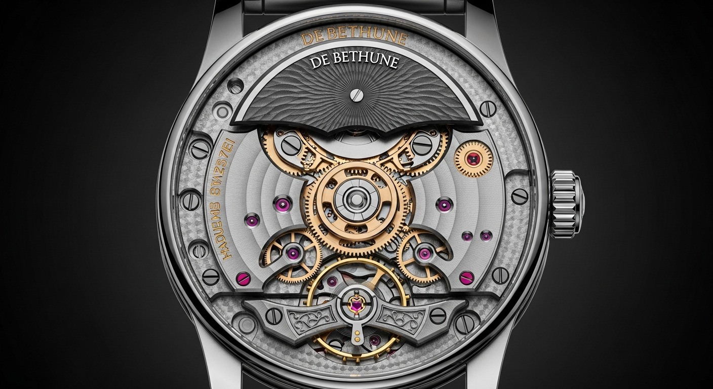
De Bethune’s future-facing identity would be fragile if the mechanics didn’t support it. What makes the brand convincing is the way technical choices reinforce the visual and conceptual goals. The brand’s work on balances, springs, and regulating organ architecture is best understood as pursuit of stability and precision through modern means, rather than reverence for traditional layouts.
Its approach is especially aligned with the idea of the wristwatch as a changing environment—temperature shifts, shocks, positional variance—where consistency is earned through engineering, not just finishing. De Bethune has been known for using advanced balance concepts and silicon components where appropriate, and for treating the escapement landscape as a place to innovate rather than to replicate. In practice, this translates to movements that look and feel proprietary: bridges with strong geometry, open views that emphasize technical components, and layouts that appear intentionally architectural.
Even when the brand references classical concerns—chronometry, energy management, shock resistance—it tends to answer them with modern materials and distinct forms. The point is not to “improve the past” as a narrative. The point is to construct a coherent present: a De Bethune watch should look like no other watch because it is built like no other watch, down to the parts you rarely see.
Astronomical complications as instruments, not nostalgia
Moonphases, star charts, and celestial indicators are common in high-end watchmaking precisely because they allow brands to borrow meaning from astronomy. De Bethune treats astronomy differently: less metaphor, more instrument. The brand’s moons are often rendered as meticulously finished spheres—frequently with a two-tone treatment that reads as both sculpture and data. The best of these executions feel calibrated, not decorated. You don’t get the sense of a romantic vignette; you get the impression of an object meant to describe a cycle accurately and beautifully.
This is where De Bethune’s restraint is more important than its spectacle. The temptation with astronomical watchmaking is to add layers until the dial becomes a crowded diorama. De Bethune often does the opposite, using negative space and controlled depth so the complication becomes a focal point rather than a gimmick. When a moonphase is integrated into a deep blue dial with minimal distractions, the complication reads as a single powerful statement: time measured against something vast and indifferent, made wearable through precision manufacturing.
Importantly, the astronomical language is not pasted onto a generic platform. It is integrated into the brand’s design DNA. The “cosmic” feeling is achieved by the collaboration of surfaces, colors, and forms—the way a dial seems to glow, the way the case reflects, the way hands and markers float over depth. The complication becomes part of a coherent system, not a one-off flourish.
Finishing at De Bethune: extreme, modern, and strategically purposeful
In the collector world, finishing is often treated as an end in itself: black polish as proof of legitimacy, anglage as a rite of passage. De Bethune meets that standard, but it also reframes it. The finishing here is not merely craft; it is presentation technology. Mirror polishing, sharp transitions, and careful brushing are used to control how the watch behaves in real light—how it moves between stealth and brilliance as the wrist turns.
There is also a distinct De Bethune tension between hand craft and industrial exactitude. The brand’s components can look almost too crisp, too intentionally designed to be “traditional,” and that is precisely the point. It’s a different type of luxury: the luxury of engineered surfaces executed to a level that feels unnatural. When the polishing is so clean that edges appear liquid, the watch starts to resemble a scientific instrument that has been elevated to art.
Collectors who respond to De Bethune tend to value this modern finishing ethos. It’s not nostalgia for the bench; it’s admiration for the result. The brand’s best pieces deliver the satisfaction of craft while avoiding the expected visual clichés. You can call it contemporary haute horlogerie, but it’s more specific than that: it is a controlled aesthetic of precision.
Iconography that behaves like a brand system, not a product line
Many brands have “icons” that are essentially successful references—one case shape here, one dial layout there—then a spread of variations in search of market coverage. De Bethune’s design language behaves more like a system. The same underlying ideas recur across different expressions: deep celestial blues, sculptural moons, architectural lugs, and movements that feel visibly proprietary. Even when the watch changes materially or mechanically, the identity remains intact.
That coherence pays dividends at the highest level of collecting, where a watch is not just a product but a position. A De Bethune can be recognized quickly, and not because it mimics any universally known vintage template. It is recognized because it insists on its own internal logic. This is rarer than it should be in a segment that often confuses price with conviction.
The net effect is that the brand’s watches feel less like “editions” and more like members of a single family of instruments. That family resemblance is not marketing; it is engineering and design discipline. For collectors who are fatigued by the endless churn of heritage reissues, De Bethune offers something that feels psychologically new: an object that points forward without trying to shout.

How to think about De Bethune as a collector: what you’re really buying
Buying a De Bethune is not primarily about spec sheets, even though the technical content can be formidable. It’s about buying into a worldview: that haute horlogerie can be modern without being loud; that finishing can be extreme without being ornamental; that astronomy can be rendered without cliché. This is why De Bethune tends to polarize. If you want your watch to reference the past in obvious ways—Breguet numerals, vintage case proportions, classical restraint—De Bethune may feel alien. If you want your watch to look like it belongs to a century that hasn’t happened yet, it becomes hard to unsee.
From a strategic standpoint, De Bethune occupies a valuable position in the independent ecosystem. It is not competing as “another great finisher” or “another revivalist.” It competes as a brand with a proprietary aesthetic and a technical backbone that supports it. That combination is what creates longevity, because it can evolve without losing itself. The brand can change materials, adjust case forms, refine movement architecture, and still remain unmistakably De Bethune.
The real collector value, then, is coherence. A De Bethune looks intentional from across a room, and that intention is reinforced up close by surfaces, depth, and motion. The watches offer the pleasure of discovery—small details, subtle curvature, the way a dial holds darkness—without relying on hidden lore. This is modern haute horlogerie that doesn’t require a lecture to make sense. It requires light.
The horizon thesis, made wearable
De Bethune’s best work makes a compelling case that the future of high watchmaking is not a race toward louder materials or more crowded dials, but a disciplined integration of design and physics. The brand treats the wristwatch as a small environment where light can be engineered, surfaces can be tuned, and astronomical cycles can be rendered with the clarity of instrumentation. It is a rare independent that doesn’t need nostalgia as scaffolding.
In a market built on the comfort of the familiar, De Bethune is strategically ambitious: it offers a horizon instead of a rearview mirror. Not every collector will want that. But for those who do, the reward is a watch that feels like an artifact of modernity—cosmic in mood, precise in execution, and unmistakably itself.
